I could write a million words on branding and not have scratched the surface, but in the context of a newly-reinvented solo artist it’s not that complicated. You don’t need to know what I stand for, what causes I champion or anything like that. It’s just … the vibe, right? Which, when you think about it, makes it a lot easier. The vibe is whatever I conjure up, and I can always re-conjure if I feel like it.
For a musician, the idea of a brand is really just maximising recognition. There’s so much happening on the various viewports to the internet – the ‘Gram, TikTok, Facebook and all the rest. You need people to recognise you in a split-second before they scroll to the next thing. So here are the elements that define adeyjordan:
First, a wordmark. “adeyjordan” – lowercase, DIN Alternate Bold, all lowercase. A weird internal glow with two complementary colours. The funny thing is that it looks quite different depending on the background – sometimes it’s blurry and mystical, sometimes super-crisp. The variability works perfectly for me, whether I’m dropping it on a black video background (blurry) or over the blue sky at the top of my speaking-to-camera mobile phone bits (crisp). Why and how did I choose this odd combination? One mug of steaming hot tea and a session with Inkscape, paired with a willingness to try something different. I’m very good at fiddling about, then making a firm decision when I see something I like.
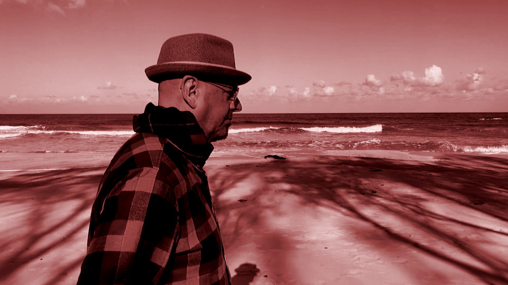
Next, a banner for this website – and also my YouTube channel, and goodness knows what else. I liked the odd pinky colour of “jordan” in my wordmark, and wondered how it would look as a duotone on a photo. I looked for recent photos of me, found nothing useful (photos of me hugging my wife are not useful for musical marketing purposes even though I very much like taking them) and so I grabbed some footage I’d taken on a beach when I was playing with the slow-motion video capability of my phone. I set up my phone and walked past it, with the sea in the background. I was just mucking about, certainly wasn’t dressed like a musician. I was dressed like a husband walking on a chilly beach! A scarf wrapped around my neck, an oddly-coloured check jacket. But add the magic of a pinkish duotone and c’est voilá! The image now has some gravitas, as if I’m pondering the ills of the world instead of being silly on a beach. Firm decision made!
A display font: once I started making videos for older songs (as part of the strategy) I decided to write the song names in a swirling font, to contrast with the plain white version of my wordmark. There’s a typeface called Sonoma Script that had in my kit forever but never used. Too frou-frou for me! In this context though, it meets the need.
What else? Me, I need to style myself! That’s simple. I’ve been shaving my head for thirty years, so I have a very shiny bonce that tends to blow out video. Hence I wear a hat. I like my blue hat, so I mostly wear that. And glasses – much as I’d prefer not to wear ’em, I can’t see without ’em, so they’re part of the brand.
And that’s it. Job’s done, I can move on to creating music and vision. That’s why I’m really here!

